How to Use Transparent Clipart in Social Media Graphics That Look Polished
Learn to choose transparent clipart, match illustration styles, and balance spacing, color, and text for polished social media graphics.

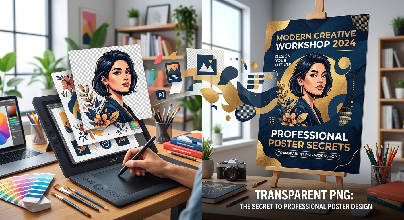
Your poster has a great image, a catchy headline, and all the event details. Yet something still feels off. The cutout looks pasted on. The date gets lost. The edges feel crowded. These problems usually come from a few small design choices, and you can fix them without starting over. Transparent PNGs give you room to arrange graphics freely. Pair them with clear typography and thoughtful spacing, and your poster can feel polished from the first glance.
A polished poster gives every image and word a clear job.
Before choosing graphics, write down what someone needs to understand. For an event, that usually means the event name, date, time, location, and how to attend. For a promotion, it might mean the product, offer, deadline, and next action. Keep this information in plain text while you plan.
Then decide which message deserves the most attention. A concert poster might lead with the performer. A community workshop might lead with the activity. A sale poster might lead with the discount. When every detail tries to be the headline, readers have to work too hard.
Choose the poster dimensions early. A portrait print, a square social post, and a tall phone graphic need different arrangements. Start with the required size instead of designing freely and squeezing the result into another shape later.
For a simple example, imagine a neighborhood plant sale. The main message is “Plant Sale.” A leaf or potted plant cutout supports that message. The date and venue form a second information group. A brief invitation to attend sits below. This gives the poster a clear purpose before you add decoration.
A transparent PNG can contain empty areas around a subject, allowing the background beneath it to show through. That makes it useful for placing a person, product, plant, or illustration directly into a layout. However, a PNG file does not automatically have transparency. Check the actual image.
Place your chosen asset over both a light background and a dark background. Look for a white rectangle, rough edges, stray pixels, or a pale outline around the subject. A checkerboard visible inside the downloaded image may be part of the picture rather than a transparency preview.
Keep the visual style consistent. A realistic product photo may look awkward beside a flat cartoon illustration. Two photographic cutouts can clash if their lighting points in different directions. Choose assets with compatible lighting, edge quality, and drawing style.
Begin with one main cutout. Add another only if it helps explain the event or offer. For the plant sale example, a large potted plant could carry the design on its own. Several unrelated leaves, flowers, watering cans, and decorative badges would make the message harder to find.
A small cutout can look sharp in a download preview and blurry on a printed poster. Check its pixel dimensions before giving it a large role. The useful measurement is the number of pixels available for the size at which the image will appear.
For print, divide the image width in pixels by its intended width in inches. A cutout that is 1,800 pixels wide provides 300 pixels per inch when printed six inches wide. At twelve inches wide, it provides 150 pixels per inch. Transparent padding around the subject also uses pixels, so check how much of the image the subject actually occupies.
Official guidance on print resolution recommends 300 PPI unless the printer requires a different value. Treat that as a useful starting point for prints viewed nearby. Ask your print provider for the requirements of your specific poster. Changing a resolution setting alone does not add missing image detail.
For a digital poster, work toward the required pixel dimensions of the final upload. Check the graphic at its intended display size. A cutout that needs heavy enlargement is a poor choice, even if its file size looks impressive.
Read the license attached to each asset. A free download does not automatically allow commercial advertising, editing, or use without credit. Check whether the permission covers your planned poster and whether attribution is required. Save the license text and source information with your project.
Logos, recognizable people, and branded characters can involve additional permissions beyond the image license. If the usage terms are unclear, choose an asset with clear permission for your intended use. Check font licenses too, especially for promotional work.
| Design Need | Transparent PNG | SVG |
|---|---|---|
| Photographic cutouts | Useful for detailed subjects with transparent edges. | Usually less suitable for photographic subjects. |
| Simple icons and drawn shapes | Works when enough pixels are available. | Vector shapes stay sharp as their size changes. |
| Enlarging an asset | Can reveal blur or pixelated edges. | Vector content scales cleanly; embedded bitmap images still have limits. |
| Importing into an editor | Commonly supported by image and layout tools. | Check that the editor supports the file and displays it correctly. |
With your message, dimensions, and assets ready, use a poster maker to assemble your chosen graphics and text. Build a rough layout before adjusting small details. Place the headline, main cutout, event information, and action text where readers can find them naturally.
A dependable starting layout puts the headline near the top, the cutout through the middle, and the supporting details below. You can also place the image on one side and the text on the other. Choose the arrangement that suits the shape of your subject.
Use the cutout's direction to guide placement. A person looking toward the text can help connect the two parts of the design. A tall plant may fit beside a narrow text column. A wide product image may work better beneath the headline.
Keep the image proportions locked when resizing. Stretching a cutout sideways can make faces, products, and familiar objects look wrong. If the asset does not fit, change its position or crop it deliberately.
Use overlap with care. Letting a cutout touch a decorative shape can connect the layout. Letting it cover letters in the date can make the poster frustrating to read. Keep practical information fully visible.
Start with one font family that offers several weights. Use a heavier weight for the headline and a regular weight for supporting information. If you want more personality, add a second font for the headline while keeping the details simple.
Give each level of information a clear size difference. The event name should stand out immediately. The date and location should be easy to find next. Extra details can be smaller, but readers should not need to zoom in to understand how to attend.
Keep lines short enough to read comfortably. A headline split across two balanced lines often works better than one crowded line. Avoid breaking a venue name or date in a place that changes its meaning.
Choose alignment deliberately. Left alignment often works well for several lines of details. Center alignment can suit a short, symmetrical design. Mixing alignments without a clear reason can make the poster feel unsettled.
Leave decorative lettering for brief text. Thin scripts and tightly packed capitals can become difficult to read at small sizes. Test the type with the actual words you need, since a font preview may hide awkward spacing or unclear characters.
Spacing tells readers which items belong together. Keep the date and time close. Give the venue its own clear place. Leave a larger gap between those details and unrelated promotional text. This creates understandable groups without adding boxes around everything.
Set a consistent margin around the poster. Keep text and meaningful parts of the cutout away from the edge. For print, ask about the safe area and bleed. Background artwork may need to extend beyond the trim line, while text stays safely inside it.
Empty space helps the headline and image stand out. If the layout feels unfinished, resist filling every gap with another graphic. Try making the main image slightly larger or adjusting the space between information groups first.
Balance also depends on visual weight. A dark cutout can draw more attention than a larger pale shape. Step back from the screen and notice where your eyes land. If decoration attracts attention before the event name, reduce its size, contrast, or detail.
Text can look readable while you are zoomed in and become faint in a phone feed. Preview the poster at a realistic size. Check the date, location, offer conditions, and action text with particular care.
For digital graphics, contrast guidance sets a minimum ratio of 4.5:1 for ordinary text and 3:1 for qualifying large text. These are useful targets for checking poster text, though contrast alone does not guarantee readability. Font size, weight, and the background still matter.
Text over a cutout or textured background needs extra attention. Check the lightest and darkest areas directly behind the letters. If readability changes across the line, move the text onto a solid background panel or a calmer part of the layout.
A grayscale preview can help reveal competing elements and similar tones. It is a useful visual check, but it does not replace a measured contrast check. Avoid using color alone to communicate an offer deadline or another key detail. State it in words.
Keep an editable copy before exporting. This lets you correct a date or create another size without rebuilding the poster. Give the project and exported files clear names that include their intended use.
For digital sharing, export at the required pixel dimensions. PNG often suits posters with text and flat graphics because it uses lossless compression. JPEG may produce smaller files for photo-heavy designs, but inspect fine text and cutout edges for compression marks.
A finished poster usually needs its background included. Transparency is useful while arranging assets, but an accidentally transparent final background may display against an unexpected color after upload.
For print, use the format your print provider requests. A print-ready PDF may preserve text and vector content, depending on the editor and export settings. Confirm the page dimensions, bleed, color requirements, and image resolution before sending it.
Open the exported file separately from the editor. Check for missing text, substituted fonts, clipped edges, and blurry graphics. View it on a phone if it will be shared digitally. For a physical poster, print a proof when possible and read it from the expected viewing distance.
Take a short break, then look at the finished design with fresh eyes. Can you identify the event or offer immediately? Can you find the date and next action without searching? Does the cutout support the message?
If the answer feels uncertain, make one focused change. Remove an unnecessary graphic. Increase the detail text. Move the headline away from a busy edge. Small edits often make a bigger difference than adding another effect.
Professional-looking posters come from clear choices. A clean transparent PNG creates a flexible starting point. Readable typography explains the message. Balanced spacing gives readers room to take it in. Careful resolution, licensing, and export checks help that design work where people will actually see it.
Learn to choose transparent clipart, match illustration styles, and balance spacing, color, and text for polished social media graphics.
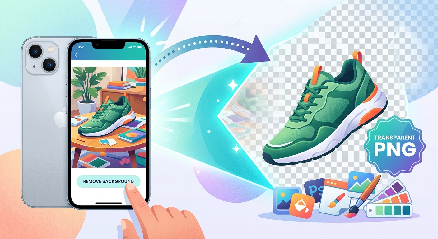
Turn iPhone product photos into transparent PNGs, clean up cutout edges, and pair them with free clipart for shop listings and social posts.

Build a smarter free asset workflow by project type. Learn how transparent PNGs and stock photos work together for social media, e-commerce, blogs, and more.
 Favorites
0
Favorites0
Favorites
0
Please add SubPNG.com in the final credits
Please add SubPNG.com in the final copy
Please add SubPNG.com to final design
Copy and paste the below code for attribution:
Don’t want to give attribution? Join Pro to get our entire library with generous usage rights, so you can use items with confidence.