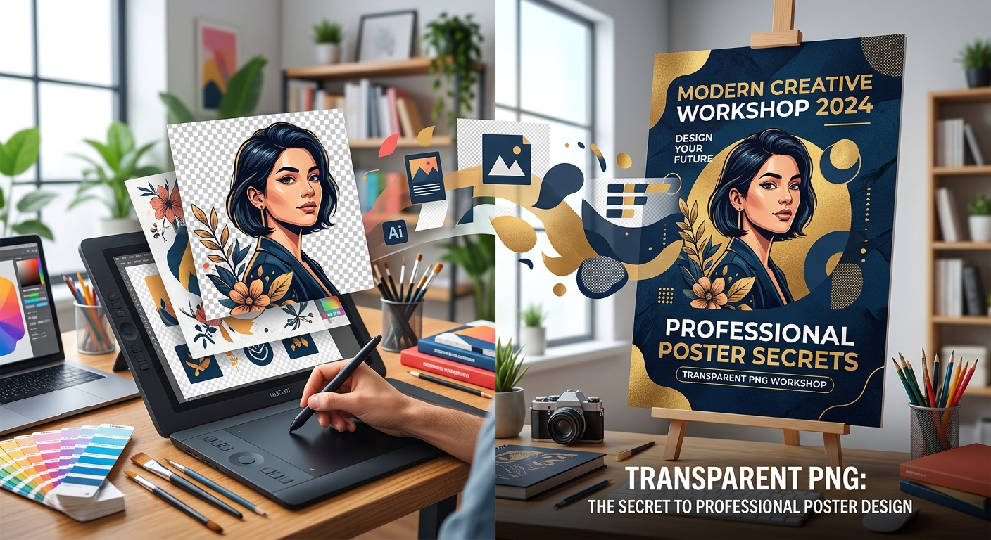
How to Use Transparent PNGs to Create Posters That Look Professional
Create polished posters with transparent PNGs, readable fonts, balanced spacing, and practical checks for image resolution, licensing, and export quality.

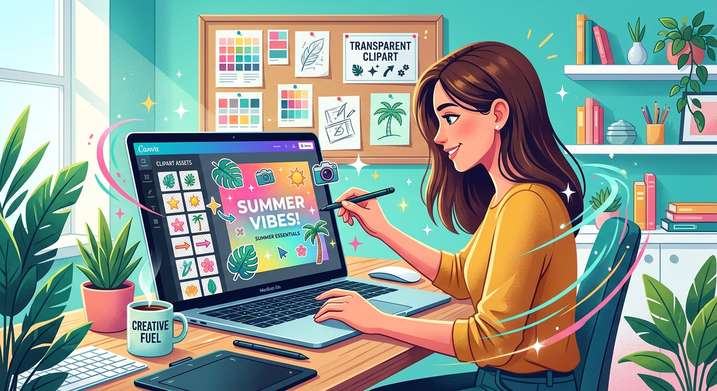
A graphic can have a lovely illustration and still feel messy. The headline fights for attention. A tiny decorative leaf floats near the edge. Three different colors compete with the message. Transparent clipart makes it easy to add artwork, but a polished result depends on how those pieces fit together. With a few simple choices, you can turn a collection of separate assets into a social media post that feels clear, balanced, and intentional.
A polished graphic gives every element a clear job and enough room to do it.
Before opening an asset library, write down what your post needs to communicate. It might announce a weekend sale, invite people to a workshop, or share a useful tip. Keep that purpose to one sentence. If you cannot explain the post simply, adding more graphics will probably make it harder to understand.
Next, decide what viewers should notice first. For an event announcement, that might be the event name. For a product offer, it could be the discount. Clipart should support that priority. A coffee cup can establish the mood of a café promotion, but it should leave enough space for the offer and its timing.
Choose your canvas shape early, too. A square feed post and a tall story need different arrangements. Use the dimensions required for your intended placement. If you need several formats, treat each as its own layout instead of squeezing the same composition into every shape.
A transparent image lets the background of your design show around the artwork. That makes it easier to place a flower, notebook, or food illustration directly into a composition without a visible rectangular backdrop.
However, a file ending in PNG does not guarantee that its background is transparent. Some images contain a white background. Others have a checkerboard pattern saved into the picture itself. Place the asset over a colored canvas to check it. If a rectangle or checkerboard remains visible, you need a different file or additional background cleanup.
Inspect the edges against both light and dark backgrounds. Pale outlines, leftover pixels, and rough cutouts can become obvious when the background changes. Pay attention to narrow details, including stems, handles, and spaces between objects. Those areas often reveal whether an asset will blend neatly into your layout.
Check image size before committing to a design. A small raster image may look soft when enlarged. Choose a file that remains crisp at its intended size, and avoid stretching it to fill space. Preserve its proportions while resizing, since a distorted illustration can make an otherwise tidy graphic feel careless.
Two graphics can share the same subject and still look unrelated. One might use thick black outlines and flat fills. Another might have soft shading and delicate brush marks. Placing them side by side creates visual tension that color adjustments alone may not fix.
Look for shared qualities across your assets. Compare outline thickness, shading, texture, viewing angle, and detail level. A simple front-facing cup usually works more naturally with a simple front-facing pastry than with a realistic pastry shown from above.
For your first few designs, choose one main illustration and keep supporting artwork minimal. If you need several objects, assets from the same illustration set can make matching easier. You still need to check their scale and arrangement, but their drawing style is more likely to feel consistent.
Avoid forcing a match through heavy effects. Adding shadows to every object will not make unrelated artwork feel unified. Start with compatible illustrations, then use effects sparingly if the composition needs them.
Your background, text, and clipart do not need to use identical colors. They do need a clear relationship. A useful starting point is one background color, one strong text color, and one accent drawn from the illustration.
If your artwork contains sage green leaves and pale pink flowers, try a cream background with deep green text. Repeat the pink in a small label or detail. That repetition helps the illustration feel connected to the layout.
Keep the main text easy to read. Pale text on a pale background can disappear, even when the combination looks attractive at full size. Check the design at a smaller viewing size. If you need to lean closer to read it, increase the text size, strengthen the contrast, or simplify what sits behind it.
Imagine you are creating a square graphic for a café's weekend pastry offer. Your message is “A Sweet Start to Saturday,” followed by “Coffee + pastry special” and a short line with the serving time. The design needs warmth, a clear reading order, and one appetizing visual.
As you follow this example, browse clipart PNG assets for a cup or pastry illustration that suits the mood. Choose clean edges, simple shapes, and colors you can repeat elsewhere in the design. Check the asset's stated usage terms before including it in a business promotion.
Start with a cream background. Place the headline in the upper part of the canvas, using dark brown text. Leave a comfortable margin around it. Add the cup illustration below and slightly to the right, where it can support the headline without interrupting the reading path.
Set the offer beneath the headline in a smaller size. Place the serving time near the bottom, keeping it readable. Use a muted pink accent for a small shape behind the offer if you want that line to stand out. Keep the shape simple and give the text room inside it.
Now pause before adding anything else. The design already has a message, supporting information, and artwork. If an empty corner feels awkward, first try moving or resizing the cup. Empty space does not automatically need another decorative object.
Spacing tells readers which elements belong together. Keep a headline and its supporting line close enough to form a group. Leave a larger gap between that group and unrelated details. This gives the layout structure without needing extra borders or boxes.
Use consistent outer margins as a starting point. Text that sits comfortably away from the left edge should have comparable breathing room near the right edge. The margins do not need to be mathematically identical, but they should feel deliberate.
Transparent files sometimes include invisible padding around the artwork. That can make alignment confusing. An image box may line up with your text while the visible illustration appears too far away. Judge the placement by the artwork you can see, and crop unnecessary transparent padding when your editor allows it.
Watch for accidental contact between elements. A leaf tip barely touching a letter can look awkward. Either separate the objects clearly or create an intentional overlap. In the café example, keep the cup's handle away from the offer text so both shapes remain easy to recognize.
A social graphic usually needs fewer words than a flyer. Use one headline, one supporting statement, and any necessary practical detail. Move longer explanations into the caption when they are not needed to understand the graphic.
Choose one readable font family to begin with. Use size and weight to distinguish the headline from the details. A second font can work, but it should earn its place. If the illustration already has plenty of personality, simple lettering often provides a useful balance.
Break lines where the wording makes sense. Keep closely related words together, and avoid leaving a single short word stranded on its own line. Read the headline aloud while reviewing the line breaks. Its visual rhythm should support its natural phrasing.
Keep text over relatively quiet areas. If detailed clipart sits behind a sentence, move the sentence or add a solid panel beneath it. A decorative outline around every letter can add clutter without solving the underlying readability problem.
Zooming in helps you inspect edges, but zooming out shows whether the design communicates. View the whole graphic at roughly the size it will appear on a phone. The headline should remain easy to read, and the main illustration should still be recognizable.
Check whether the smallest details deserve space. Tiny stars, faint textures, and miniature labels may contribute little at that size. Remove anything that distracts from the message or becomes visual noise.
Export at the intended canvas dimensions, then inspect the saved file. Look for blurry artwork, clipped text, and unexpected background changes. Keep your editable design file as well. It will make future changes easier when an offer, date, or format needs updating.
Polished social media graphics come from thoughtful choices. Choose artwork that fits the message. Match its style to any supporting assets. Repeat a few colors, give text a clear order, and leave enough space for each element to read comfortably.
Before publishing, ask what each piece contributes. If a decoration adds little, remove it and review the result. Often, a single clean illustration, a readable headline, and generous spacing are enough to make the post feel finished.
Create polished posters with transparent PNGs, readable fonts, balanced spacing, and practical checks for image resolution, licensing, and export quality.
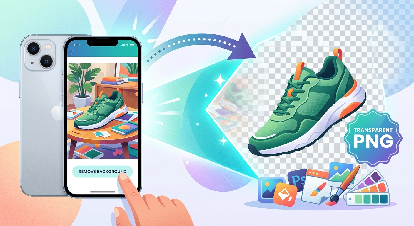
Turn iPhone product photos into transparent PNGs, clean up cutout edges, and pair them with free clipart for shop listings and social posts.
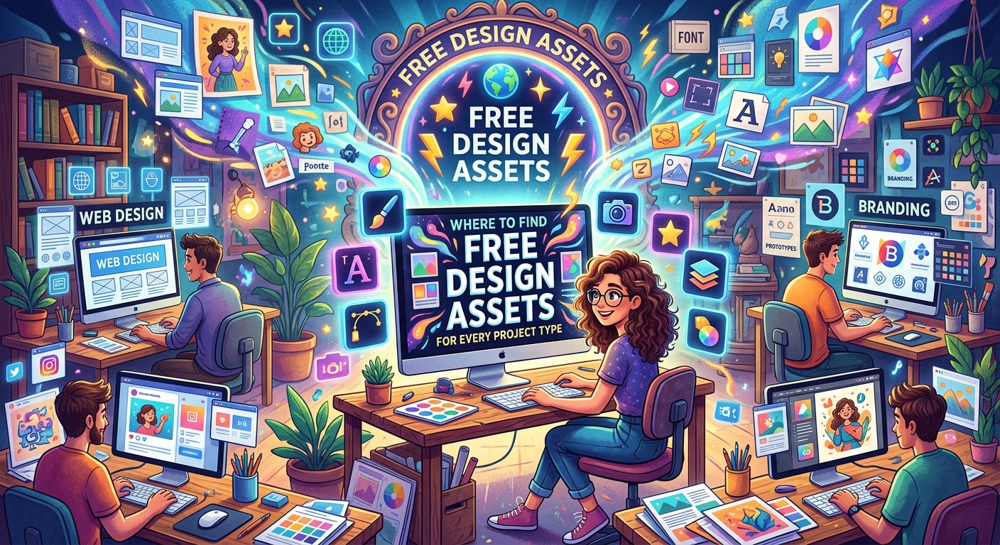
Build a smarter free asset workflow by project type. Learn how transparent PNGs and stock photos work together for social media, e-commerce, blogs, and more.
 Favorites
0
Favorites0
Favorites
0
Please add SubPNG.com in the final credits
Please add SubPNG.com in the final copy
Please add SubPNG.com to final design
Copy and paste the below code for attribution:
Don’t want to give attribution? Join Pro to get our entire library with generous usage rights, so you can use items with confidence.