
How to Use Transparent Clipart in Social Media Graphics That Look Polished
Learn to choose transparent clipart, match illustration styles, and balance spacing, color, and text for polished social media graphics.

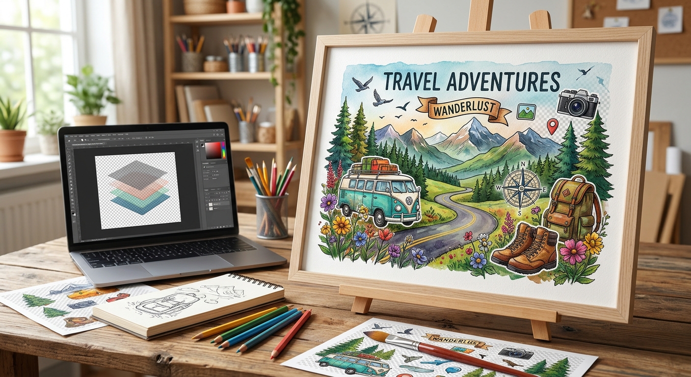
A white rectangle around a flower illustration can spoil an otherwise finished invitation. A blurry icon can make a sharp presentation feel unfinished. Transparent clipart helps avoid those problems, but downloading a graphic is only the beginning. The real work happens when you resize it, place it beside text, convert it for another app, and export the final design. A few careful checks can turn a useful download into an asset that looks right wherever your project ends up.
Before choosing a download, decide what you are making. A classroom worksheet, an online shop banner, and a large printed poster place different demands on an image. Your destination affects the file type, image dimensions, background treatment, and final export settings.
For readers browsing a free graphic library, it is tempting to choose an appealing image and deal with the details later. A better habit is to check whether the asset can support the intended size. A small transparent PNG may look crisp beside a blog heading yet become visibly soft across a presentation slide.
Consider the background, too. A pale illustration might disappear on a white worksheet. Dark outlines may become difficult to see against a navy slide. Transparency removes a surrounding rectangle. It does not guarantee that every part of the artwork will remain readable on every surface.
PNG stores an image as pixels and can preserve transparent areas. It is useful when you need a ready-made graphic for a layout tool, presentation, website, or social post. Its main limitation is size. Enlarging a small PNG cannot restore detail that was absent from the original.
SVG can describe shapes and paths that remain sharp as they scale. That makes it useful for simple illustrations, symbols, and decorative elements that need several sizes. Some SVG files also contain embedded raster images, though. Check the actual artwork before assuming that every element will scale cleanly.
Compatibility varies between applications and publishing systems. Your design app might accept an SVG while a submission portal accepts only PNG or JPEG. Check the destination requirements before building the entire project around one format.
JPEG cannot retain an alpha transparency channel. If you convert a transparent image to JPEG, its transparent areas must become a solid background. Choose that background deliberately. For a white flyer, white may be suitable. For artwork that must sit on several backgrounds, keep a transparent version available.
A free browser-based service fits naturally at the point where an asset and a destination disagree. You might have an illustration in a format your editor cannot import. Or you may need a separate copy for a publishing system with narrower upload requirements.
An online image converter can fit into that preparation step when its available input and output options match your files. Check the supported formats and conversion settings before proceeding. Then download the result and inspect it before adding it to your finished layout.
Treat conversion as a compatibility task. Changing a filename extension does not convert the underlying file. Converting a small image to a larger canvas does not create missing detail. Converting a flattened image to PNG does not automatically remove its background.
Work from a copy of your original download. Give the converted version a clear name that identifies its purpose, perhaps “leaf-slide-transparent.png.” This makes it easier to distinguish a usable production file from experiments and rejected versions.
A public clipart download and an unreleased customer campaign deserve different handling. Before using any browser tool, consider what the file contains. A graphic may include a client logo, a photograph, private text, or identifying information in its metadata.
Read the service’s privacy information before submitting sensitive material. Look for an explanation of where processing happens, whether files are uploaded, how long uploaded files remain available, and how deletion works. A browser interface alone does not tell you whether processing stays on your device.
If the information is unclear, use an approved local application for confidential work. For a simple format change, submit only the asset that needs conversion. There is rarely a reason to upload a complete campaign layout just to prepare one decorative element.
A checkerboard preview usually represents transparency inside an editor. However, some downloaded graphics contain a checkerboard baked into the image itself. Place the file over a solid color to check. If the squares remain visible, they are part of the artwork.
Test the asset against light and dark backgrounds. Pale fringes around an illustration may disappear on white but become obvious on charcoal. These fringes can come from background removal or edge pixels blended with an earlier background.
View the graphic at its intended size as well as at a closer zoom. High magnification helps you spot stray pixels and rough cutouts. Actual-size viewing tells you whether those details affect the finished design.
Transparent padding deserves attention, too. An asset can have a large empty canvas around a small visible illustration. That extra space can make alignment awkward and cause inconsistent sizing between icons. Crop unnecessary padding while leaving enough room for shadows or decorative edges.
Clipart works best when it supports a specific message. A small plant illustration can soften a gardening handout. An arrow can direct attention toward a registration deadline. A product illustration can help readers understand a category before they read its label.
Choose one visual style for a related group of assets. Mixing thick cartoon outlines with delicate shaded drawings can make a layout feel assembled from unrelated sources. Matching line weight, color intensity, and perspective creates a more coherent result.
Leave space around text. Transparent areas can make an image seem less intrusive than it really is, especially when branches, stars, or decorative marks extend toward a heading. Judge spacing by the visible artwork, rather than only by the selection box.
Keep key information as editable text whenever possible. Dates, prices, instructions, and contact details are easier to correct that way. On websites, provide appropriate alternative text for informative images. Purely decorative images should be handled as decoration so they do not interrupt assistive reading.
The editor preview is one checkpoint. The exported file is another. Open the actual deliverable after saving it, then inspect it in the application or setting where someone will use it.
Pay attention to shadows, translucent edges, cropping, and color shifts. These details can change during export or when another application interprets the file. If something looks wrong, compare the exported asset with the original before changing the entire layout.
For raster artwork, relate pixel dimensions to physical output size. A 1,200-pixel-wide image placed four inches wide provides 300 pixels per inch. That calculation helps you assess a print placement, although the printer’s requirements and the artwork itself still determine what is suitable.
Keep the original download, your prepared asset, the editable project, and the final export. Each serves a different purpose. The original lets you restart a conversion. The prepared asset supports reuse. The editable project lets you change the layout without rebuilding it from a flattened image.
Save licensing information at download time. Free access does not automatically mean unrestricted commercial use. Check whether attribution is required, whether modifications are allowed, and whether the asset can be used in merchandise or redistributed. Logos and recognizable characters may involve rights beyond the download terms.
Store a copy of the relevant license text or a dated record with the project. If attribution is required, include it in the appropriate place before delivery. This small habit prevents a finished design from becoming difficult to document months later.
A finished project should make the clipart feel intentional. The edges should sit cleanly against the background. The size should suit the destination. The file should open correctly, and the usage terms should support the planned release.
Before sending your work, review the actual export once more. Check the smallest text, the largest illustration, and any area where transparency meets a strong background color. Those few minutes often catch the details that separate an attractive draft from a dependable finished file.
Learn to choose transparent clipart, match illustration styles, and balance spacing, color, and text for polished social media graphics.
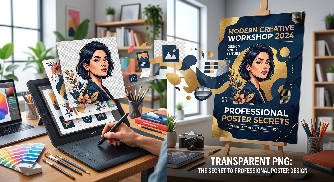
Create polished posters with transparent PNGs, readable fonts, balanced spacing, and practical checks for image resolution, licensing, and export quality.
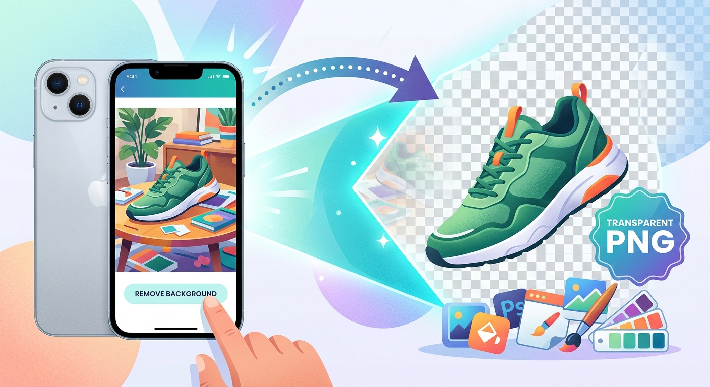
Turn iPhone product photos into transparent PNGs, clean up cutout edges, and pair them with free clipart for shop listings and social posts.
 Favorites
0
Favorites0
Favorites
0
Please add SubPNG.com in the final credits
Please add SubPNG.com in the final copy
Please add SubPNG.com to final design
Copy and paste the below code for attribution:
Don’t want to give attribution? Join Pro to get our entire library with generous usage rights, so you can use items with confidence.